De UI/UX van deze webpagina is ontworpen voor een bestaande website als een testpagina, met als doel meer leads te genereren. De keuze om een herhalende "Neem contact op" knop in meerdere secties op te nemen was bewust, zodat potentiële klanten meerdere kansen hadden om te klikken en naar het contactformulier hieronder te worden geleid.
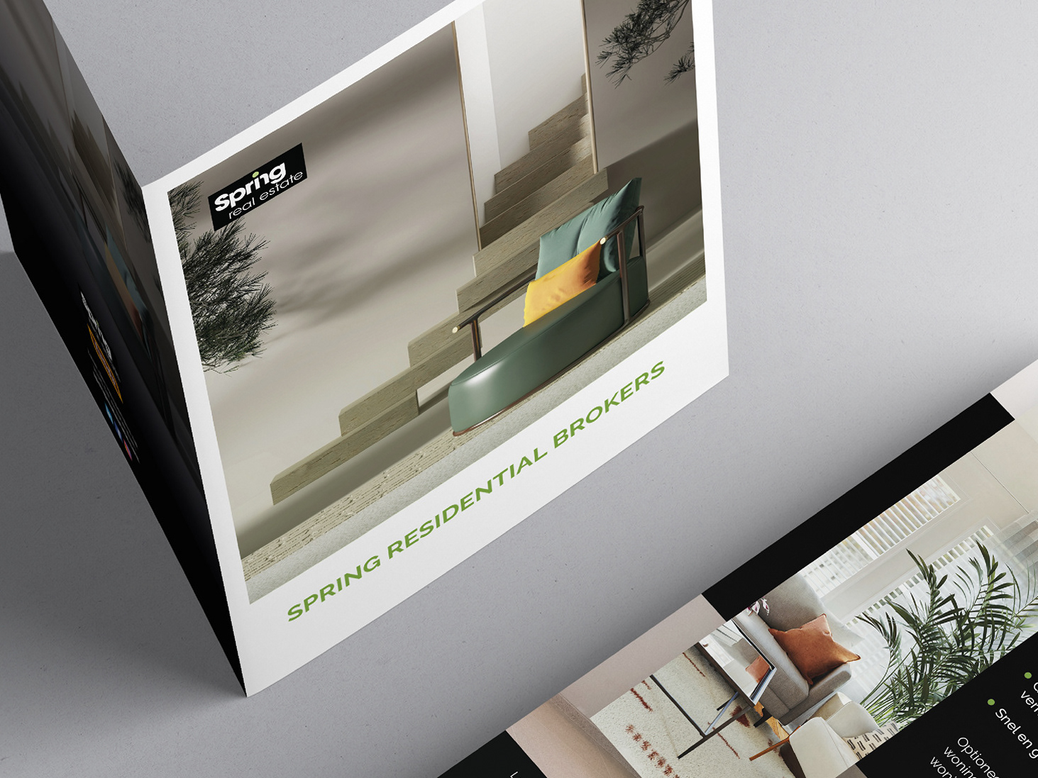
Mijn klant vroeg specifiek om een one-page design. Ik kreeg de inhoud aangeleverd en was verantwoordelijk voor het selecteren van geschikte afbeeldingen en de styling, zodat deze aansloten bij de bestaande branding van Spring Real Estate.
Click here to check the desktop version on Figma.
Click here to check the mobile version on Figma.